When writing classes for HTML elements from scratch, we want to make sure we are making our code readable, and make sure that our stylesheets are reusable, and maintainable. To that end, we have adopted a few methods for naming classes:
- Content-Agnostic Reusable Components and the BEM Method
- Functional Utility Classes
Primarily, the goal is to reduce the size of our stylesheets (for performance and maintainable reasons), and to keep from having duplicate code (to make the work of coding easier, and to make sure that we don’t have slight inconsistencies across similar elements).
Two Beginning Reminders
Client Prefixes: A Must-Have
Don’t Over-Abbreviate
Content-Agnostic Reusable Components
Examine the design for the project you’re working on. Are there multiple elements or sections that have the same styling, just with different content? Do multiple containers have the same flair added to them, but with different child elements?
Wherever possible, write classes that allow for the CSS to be reused for similar components.
Consider these two UI elements in the design: the Author Bio and the Article Preview.
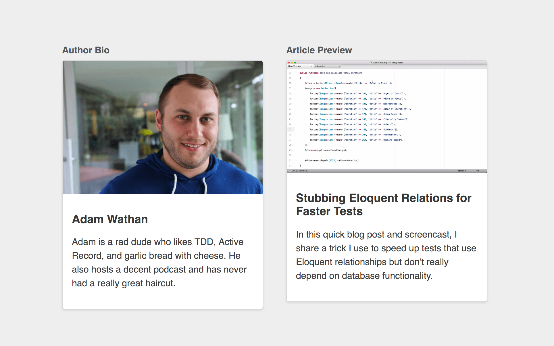
Both components have the same basic elements:
- a full bleed image on the top
- a padded content section below
- a bold title
- and some smaller body text.
If you name the classes based on the content, then you might write html that looks like this:
<div class="container">
  <div class="author-bio">
    <img src="https://cdn-images-1.medium.com/max/1600/0*o3c1g40EXj65Fq9k." alt="">
    <div>
      <h2>Adam Wathan</h2>
      <p>
        Adam is a rad dude who likes TDD, Active Record, and garlic bread with cheese. He also hosts a decent podcast and has never had a really great haircut.
      </p>
    </div>
  </div>
</div>
and
<div class="article-preview">
  <img src="https://i.vimeocdn.com/video/585037904_1280x720.webp" alt="">
  <div>
    <h2">Stubbing Eloquent Relations for Faster Tests</h2>
    <p>
      In this quick blog post and screencast, I share a trick I use to speed up tests that use Eloquent relationships but don't really depend on database functionality.
    </p>
  </div>
</div>
When you go to style these components, you’ll find that you have to duplicate a lot of the styles to make this work.
To reduce the duplication, and remove the possibility for inconsistencies, opt for Content-Agnostic class names for these components.
…here’s what the markup for our author bio would look like:
<div class="media-card">
  <img class="media-card__image" src="https://cdn-images-1.medium.com/max/1600/0*o3c1g40EXj65Fq9k." alt="">
  <div class="media-card__content">
    <h2 class="media-card__title">Adam Wathan</h2>
    <p class="media-card__body">
      Adam is a rad dude who likes TDD, Active Record, and garlic bread with cheese. He also hosts a decent podcast and has never had a really great haircut.
    </p>
  </div>
</div>
…and here’s the markup for our article preview:
<div class="media-card">
  <img class="media-card__image" src="https://i.vimeocdn.com/video/585037904_1280x720.webp" alt="">
  <div class="media-card__content">
    <h2 class="media-card__title">Stubbing Eloquent Relations for Faster Tests</h2>
    <p class="media-card__body">
      In this quick blog post and screencast, I share a trick I use to speed up tests that use Eloquent relationships but don't really depend on database functionality.
    </p>
  </div>
</div>
Then, we can write one block of CSS that will style both of these components:
.media-card {
  background-color: white;
  border: 1px solid hsl(0,0%,85%);
  border-radius: 4px;
  box-shadow: 0 2px 4px rgba(0,0,0,0.1);
  overflow: hidden;
}
.media-card__image {
  display: block;
  width: 100%;
  height: auto;
}
.media-card__content {
  padding: 1rem;
}
.media-card__title {
  font-size: 1.25rem;
  color: rgba(0,0,0,0.8);
}
.media-card__body {
  font-size: 1rem;
  color: rgba(0,0,0,0.75);
  line-height: 1.5;
}
BEM Method
Once you’ve started your reusable Content-Agnostic Component class naming, follow the BEM Methodology for class naming of the Component/Block’s child elements.
BEM stands for Block, Element, Modifier.
Block
Encapsulates a standalone entity that is meaningful on its own. While blocks can be nested and interact with each other, semantically they remain equal; there is no precedence or hierarchy. Holistic entities without DOM representation (such as controllers or models) can be blocks as well.
| Naming | HTML | CSS |
|---|---|---|
Block names may consist of Latin letters, digits, and dashes. To form a CSS class, add a short prefix for namespacing: .block | Any DOM node can be a block if it accepts a class name. <div class="block">...</div> | Use class name selector only. No tag name or ids. No dependency on other blocks/elements on a page. .block { color: #042; } |
Element
Parts of a block and have no standalone meaning. Any element is semantically tied to its block.
| Naming | HTML | CSS |
|---|---|---|
Element names may consist of Latin letters, digits, dashes and underscores. CSS class is formed as block name plus two underscores plus element name: .block__element | Any DOM node within a block can be an element. Within a given block, all elements are semantically equal. | <div class="block"><span class="block__element"></span></div> |
Modifier
Flags on blocks or elements. Use them to change appearance, behavior or state.
| Naming | HTML | CSS |
|---|---|---|
Modifier names may consist of Latin letters, digits, dashes and underscores. CSS class is formed as block’s or element’s name plus two dashes: .block--mod or .block__element--mod and .block--color-black with .block--color-red. Spaces in complicated modifiers are replaced by dash. | Modifier is an extra class name which you add to a block/element DOM node. Add modifier classes only to blocks/elements they modify, and keep the original class. | Use modifier class name as selector: .block--hidden { } To alter elements based on a block-level modifier: .block--mod .block__element { } Element modifier: .block__element--mod { } |
Functional Utility Classes
Across your entire project, you may find that many elements need small modifications that aren’t solved well by what we’ve already discussed in this article. For example, many different elements may need the option to be set to have zero bottom margin. When necessary, creating utility classes is acceptable, and sometimes even preferred, to make writing HTML code faster and make more of your CSS reusable.
In these cases, creating a set of utility classes, and placing them in a _generic.scss file is the appropriate solution.
WordPress Core has many built-in utility classes. Most notably, the class names for font size, font color, and background color that are set by using back end style options. Use these whenever possible.
Resources
The content in this article is heavily drawn from the articles below. Please read for more context, nuance, and explanation.